Digital style guides — practical systems for modern brands
Create consistent, scalable brands with Hanukor's digital style guides: logo systems, colour & type libraries, UI components, and ready-to-use templates for web and social.
AUS-focused • Developer-ready • Accessible

Lead Designer — Emma J.
Specialist in cross-platform visual systems and accessible colour technology.
What a digital style guide includes
Jump to FAQ
Logo system
Primary, stacked and monochrome lockups, spacing rules and misuse examples.
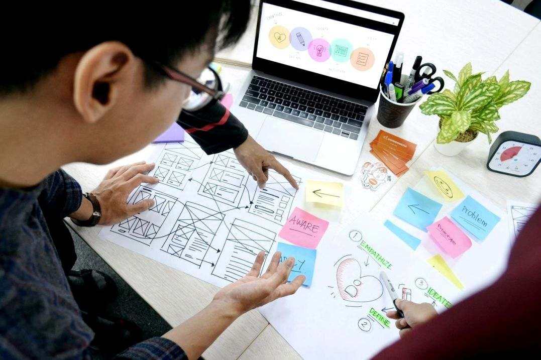
Colour & accessibility
Core palette, supporting tints, and WCAG contrast guidance for digital use.

Type & scale
Web and print typography, responsive scale, line-height and pairing rules.
Components & patterns
Reusable UI components and pattern guidance for consistent implementation across websites, apps and marketing assets.
Buttons, forms & states
Clear rules for primary, secondary and ghost buttons, plus form field states.

Cards & layout grid
Grid system, container widths and card anatomy for modular layouts.
Template gallery
Starter templates for website pages, email headers, social posts and print-ready brochures.
Website hero
Responsive hero with CTA and variant examples.
Email header
Accessible header with logo lockup and social links.
Social creatives
Square and vertical layouts for Instagram and stories.
Print flyer
CMYK-ready, bleed and safe-zone specs included.
Workflow & handoff
How we deliver: discovery, concept, system build, documentation and developer handoff.
Frequently asked questions
Resources & pricing
Starter packs and custom system quotes — examples below. For a tailored estimate, request a discovery call.
| Package | Included | Lead time | From |
|---|---|---|---|
| Starter tokens | Colours, type scale, logo rules | 1–2 weeks | AUD 1,800 |
| Component set | Buttons, cards, forms, grid | 2–4 weeks | AUD 4,200 |
| Full system | Library, templates, docs, handoff | 4–8 weeks | From AUD 8,500 |